The stock android vs one ui comparison is really a question about how much software you want between you and Android itself. Stock Android — as Google ships it on Pixel phones, close to the platform reference design — is lean: one app for each job, fast updates, and an interface that gets out of the way. One UI, Samsung layer on the same foundation, is generous: more features, more customization, more Samsung services woven through everything, in exchange for more complexity and a little duplication.
Both run the same apps from the same Play Store, both are secure, and both will feel familiar within a week. What differs is daily texture — how your home screen behaves, how quickly updates arrive, which features exist, and how much of the phone feels designed by one hand. This guide compares them honestly, including the myth that one is simply Android done right.
Disclosure: As an Amazon Associate, kajuandouglas.com earns from qualifying purchases. Links to Amazon on this page are affiliate links; they cost you nothing extra. Listing details such as price and availability change often, so check the current Amazon listing before you buy.
Quick verdict: choose stock Android if you value speed, simplicity, first-day updates, and a clean single-app-for-everything design. Choose One UI if you want deeper customization, superior multitasking, automation routines, and hardware-software extras like DeX — and you do not mind some duplicate apps and a busier settings menu. Power users lean One UI; minimalists lean stock.
Gear for This Guide
One verified exemplar from each camp, plus the shared charger reality.

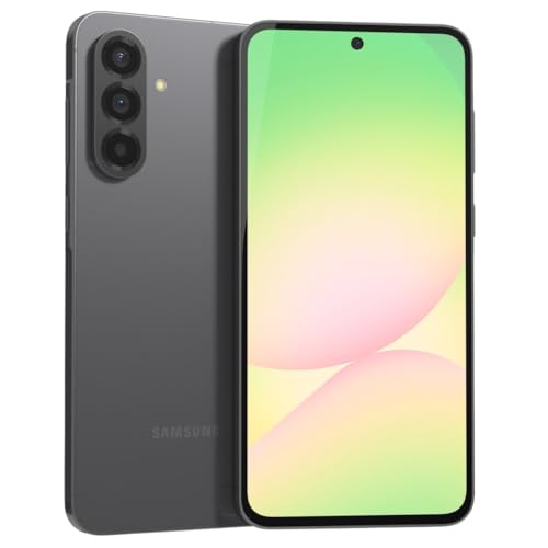
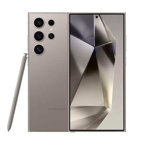
Samsung Galaxy S24 Ultra Cell Phone, 256GB AI Smartphone, Unlocked Android, 200MP, 100x Zoom Cameras, Fast Processor, Long Battery Life, Edge-to-Edge Display, S Pen, US Version, 2024, Titanium Gray — The One UI flagship experience complete with S Pen and DeX — if the feature-rich path appeals, this is its fullest expression. Check price on Amazon.

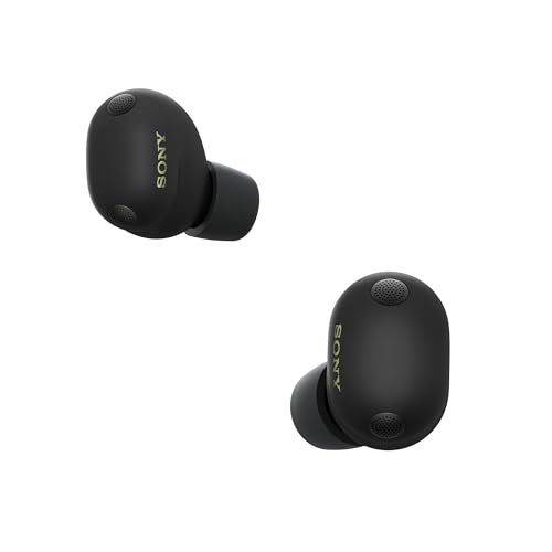
Google Pixel Buds Pro 2 – Wireless Bluetooth Earbuds – Hazel — Pixel Buds Pro 2 embody the stock-Android philosophy in accessory form: few controls, deep Google integration, and intelligence doing the work quietly. Check price on Amazon.
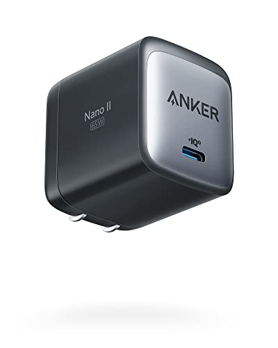
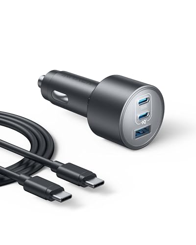
Anker Nano 65W GaN II PPS USB C Charger, Fast Compact Foldable Charger — Whichever interface wins your heart, the charger situation is identical — neither flagship box includes one, and a single GaN USB-C charger serves both. Check price on Amazon.
In this guide
Side-by-Side: Stock Android vs One UI
The same foundation, two temperaments: one subtracts, the other adds.
| Criterion | Stock Android (Pixel-style) | One UI (Samsung) |
|---|---|---|
| Interface feel | Minimal, consistent, Google design throughout | Richer, more options, one-handed-friendly large headers |
| Duplicate apps | One gallery, one assistant, one store focus | Samsung apps alongside Google equivalents in several categories |
| Updates | First to receive new Android versions and monthly patches | Fast for flagships but staged by model and region; typically weeks behind |
| Customization | Wallpapers, widgets, some theming; launchers available | Deep theming, Good Lock modules, edge panels, routines automation |
| Multitasking | Split screen and picture-in-picture, kept simple | Polished split screen, pop-up windows, multi-window trays |
| Exclusive features | Call screening, recorder transcription, Google AI tools | DeX desktop mode, S Pen tools, Samsung ecosystem integrations |
| Learning curve | Gentle — fewer settings, clearer defaults | Steeper — enormous settings depth rewards exploration |
| Long-term support | Up to seven years on recent Pixel flagships | Up to seven years on recent Samsung flagships |
Design and Daily Feel
Stock Android feels like a well-kept room: everything in reach, nothing extra on the counters. Google design language runs unbroken from the lock screen to the settings, animations are quick, and there is exactly one obvious way to do each common thing. For people who use their phone as a tool and resent fiddling, that restraint is the feature. The trade-off is that when you want more — a different gesture, a smarter home screen, a deeper automation — the system mostly shrugs and points you to a third-party launcher.
One UI feels like a workshop: more tools than you will ever use, arranged with real thought about one-handed use on big phones — content sits low, headers are tall, reachability is a design principle. Samsung own apps are often genuinely good; its gallery, notes, and browser have loyal fans who choose them over Google equivalents. The cost is visual and mental noise: two app stores, two clouds nudging you, and a settings menu deep enough to hide things from their owner. Whether that reads as generous or cluttered is honestly a personality test.
Features and Multitasking
On raw capability, One UI wins clearly. Its multitasking is the best on any phone: split screen with saved app pairs, floating pop-up windows, an edge panel of tools and contacts. Routines — Samsung automation system — can silence the phone at the office, read texts aloud in the car, or change dozens of settings by trigger, no third-party app needed. Good Lock modules let enthusiasts rebuild the lock screen, task switcher, and gestures. DeX turns the phone into a desktop on any monitor. Stock Android simply does not contest most of this.
Stock Android counters with intelligence instead of inventory. Call screening has an assistant answer unknown numbers; the recorder transcribes and labels speakers; photo and assistant features tend to debut here, woven into the few apps that exist rather than spread across many. Its features aim to save you actions rather than offer you options. If your dream phone quietly handles spam, transcribes meetings, and stays out of the way, stock does that. If your dream phone bends into the exact tool each situation needs, One UI is built for you.
Updates, Performance, and Polish
Pixel-style stock Android receives new versions and security patches first — on release day, all models at once. One UI flagships are well supported for just as long on recent models, but updates roll out in stages and can trail by weeks, with carrier variants trailing further. For security, both are fine in practice; for the impatient and the feature-curious, stock wins the calendar.
Performance is closer than folklore suggests. Stock Android leanness shows in quick animations and modest storage footprint, while One UI runs on Samsung typically stronger flagship hardware, which compensates for its heavier software. Mid-range is where the difference can bite: a modest processor carrying One UI full feature set works harder than the same chip under stock Android, so budget Samsung buyers should prioritize RAM and storage, while Pixel a-series buyers get the lean software advantage built in.
Ecosystem and Services
Choosing between these interfaces is also choosing a services gravity well. Stock Android centers your Google account: Photos, Drive, Gemini-era assistant features, and a watch and earbuds line designed as one product family. One UI adds a Samsung account layer — Samsung Cloud backups, Galaxy Store, SmartThings for home devices, and tight integration with Galaxy watches, buds, and tablets that sometimes exceeds what Google own hardware achieves.
Neither lock-in is a prison; your core Google account, apps, and data move freely between them. But the extras you grow fond of — routines you built, DeX habits, call screening, transcription archives — are the real switching costs, and they accumulate quietly. Pick the gravity well whose extras match your life, because in two years those, not the home screen, are what you will miss.
Who Each Option Suits
Choose stock Android if…
You want the phone to disappear into your tasks: fast updates, no duplicates, a calm interface, and smart features that act on your behalf. You are new to Android, switching from iPhone and wary of clutter, or you simply believe a phone should have one gallery app and it should be excellent.
Choose One UI if…
You enjoy shaping a device: themes, gestures, automations, multitasking layouts. You will use split screen weekly, routines daily, or DeX ever. You are buying Samsung hardware anyway for its screens, cameras, or S Pen, and you see the software depth as the bonus it is rather than the burden it can be.
Final Recommendation: Stock Android vs One UI
There is no wrong answer here, only a mismatch. Stock Android is the better default for most people — simpler to learn, faster to update, calmer to live with. One UI is the better ceiling for people who will actually climb to it — its multitasking and automation are unmatched, and its fans are fans for earned reasons. The mistake is buying One UI and drowning in options you never wanted, or buying stock and spending a year installing apps to rebuild features Samsung included free.
If you can, spend fifteen minutes with each in a store: open Settings, rearrange the home screen, split two apps, find the same three settings on both. Your comfort in those minutes predicts your next three years better than any reviewer verdict — including this one.
What Stock Android and One UI Actually Are
Stock Android, as most people mean it, is Google’s own presentation of Android: the interface on Pixel phones and a close relative on a few other devices, with Google’s apps, Google’s design language, and minimal additions. One UI is Samsung’s full reimagining layered over the same Android foundation: different visuals, Samsung’s own apps alongside Google’s, and a deep catalogue of extra features. Underneath, both run the same apps, the same notifications system, and the same permissions model. The difference is the layer you touch — which, since you touch it hundreds of times a day, is not a superficial difference at all.
Why the same Android version feels like two phones
Because the interface layer governs the home screen, the settings layout, the quick settings panel, the camera app, the gallery, the keyboard defaults, and dozens of small behaviours, two phones on the identical Android version can feel unrelated. Settings live in different places, gestures have different extras, and even the phone dialler behaves differently. This is why switching between a Pixel and a Samsung involves a relearning week despite staying on Android, and why written how-to instructions always specify which interface they describe. Neither layer is a skin in the dismissive sense; One UI in particular is closer to an alternative edition of the whole experience.
Features: Abundance Versus Restraint
One UI’s defining trait is abundance. It offers extensive multitasking with split screens and floating windows, a powerful theming engine, automation routines that trigger actions by time, place, or event, edge panels, a system-wide good-lock style customisation culture on supported models, and modes for everything. Stock Android’s defining trait is restraint: fewer features, each integrated with Google’s services, with intelligence features — call screening, transcription, photo magic — doing work invisibly rather than presenting options. The question is temperamental. Options delight people who use them and quietly tax people who do not, in settings clutter, duplicate apps, and decisions. Most users use a small fraction of One UI’s extras; the fraction they use, they often love fiercely.
Duplicate apps and the two-of-everything question
A Samsung phone arrives with Samsung’s and Google’s versions of several things: two app stores, two browsers potentially, two galleries, two assistants historically. You can choose defaults and ignore or disable the duplicates, and many owners do this once and never think again. Others find the duplication permanently untidy. Stock Android has no such negotiation; Google’s app is the app. Beginners and minimalists tend to prefer the single answer. Tinkerers tend to enjoy picking winners. Be honest about which you are, because you will live inside that choice daily.
Updates, Performance Feel, and Longevity
Pixel phones receive new Android versions and monthly security patches first, directly from Google, and stock Android’s lightness historically keeps older Pixels feeling responsive. Samsung’s update delivery has improved dramatically, with long commitments on popular models, but new versions arrive later and One UI’s richness places heavier demands on ageing hardware. In practice, a flagship Samsung shrugs off its own interface for years, while a budget Samsung running full One UI can feel its weight sooner than a comparably priced lean-Android phone. If you buy mid-range or budget and keep phones long, the interface’s weight belongs in your calculation alongside the chip.
AI features and where each side invests
Google invests its intelligence in communication and photos: screening calls, holding for you, transcribing, and editing images in ways that feel like magic tricks with genuine utility. Samsung invests in its own suite spanning translation, summarisation, and photo editing, plus hardware-led features tied to its devices such as stylus intelligence on Ultra models. The suites overlap increasingly, and both lean on cloud processing for their fanciest tricks. If one specific intelligent feature — call screening is the common example — solves a daily pain for you, that feature can and should outweigh abstract interface preference.
Customisation: The Deep End Versus the Shallow End
One UI lets you reshape the phone extensively without third-party tools: themes that restyle icons and menus together, lock-screen designs, always-on display personalities, gesture variations, and per-app sound and notification behaviours. Stock Android offers tasteful, limited personalisation — wallpaper-driven colour theming is its signature — and then gets out of the way. There is a paradox here worth naming: the users who most enjoy customisation often spend a weekend setting it up and then never change it again, which means the practical difference is one delightful weekend and a phone that thereafter simply reflects older choices. Buy One UI for features you will use weekly, not for a customisation project you will complete once.
One-handed use and design intent
One UI was literally designed around one-handed reach, pulling interactive elements toward the bottom of tall screens, and on large Samsung phones that intent is felt constantly. Stock Android follows Google’s design language, which is clean and consistent with Google’s apps and services across the web — a coherence that matters if you live in those services, because the phone feels like an extension of the same system rather than a separate device. Design coherence versus ergonomic intent is a subtle, real fork; handling both interfaces in a shop for ten minutes teaches more than any specification.
Choosing by Temperament: A Summary
- Choose stock Android if: you want the phone to disappear, value earliest updates, live in Google’s services, and prefer one app per job.
- Choose One UI if: you enjoy tailoring, multitask heavily, want features like automation routines and deep theming, or own other Samsung devices.
- Budget and long-keeping: lean stock or lighter interfaces, which age more gracefully on modest hardware.
- Large-phone lovers: One UI’s one-handed design genuinely helps on the biggest screens.
- The undecided: handle both; interface feel is immediate and personal, and ten minutes in hand settles what ten reviews cannot.
There is no wrong door here — only a door that fits your hand better. Both interfaces are mature, secure, and supported for years, and the Android underneath guarantees your apps and skills transfer if you ever switch sides.
A Week in Each Interface: Where the Differences Actually Appear
Monday morning, both phones wake you, both show the weather, both deliver the night’s messages. The differences live in the margins of the day. On the stock Android phone, a spam call never rings because screening handled it, and the voicemail arrives as text. On the One UI phone, the morning routine you configured dims the screen, reads the calendar, and starts the coffee playlist without being asked, because you built that automation on a Sunday and it has served you since. At work, the Samsung splits its screen between a document and email in a way the Pixel declines to match for elegance; the Pixel, asked to transcribe the meeting, produces a searchable record the Samsung answers with its own capable but different tools. Neither day is better. They are differently better, in the image of their makers’ beliefs about what a phone is for.
The settings safari
Every interface reveals itself when something needs changing. Stock Android’s settings are shallower: fewer levels, predictable names, a search that finds things. One UI’s settings are deeper and wider, with genuinely useful options stock Android lacks — and with the occasional treasure buried three menus down under a name you would not have guessed. Users who change settings twice a year prefer stock’s shallows. Users who tune their phone like an instrument prefer One UI’s depths and learn its geography once, after which the depth stops costing anything. The honest question is not which settings app is better but how often you personally go digging, and most people, asked honestly, answer: rarely, except in the first month — which argues that this factor, loudly debated, quietly matters less than the features you touch daily.
Performance Over Time: Weight, Updates, and Ageing
Interfaces age differently on the same hardware class. Stock Android’s lightness means a three-year-old Pixel often feels closer to its younger self than a three-year-old budget Samsung carrying the full One UI, though Samsung’s flagships have the power to shrug off their own richness for many years. The variable is the pairing of interface weight to hardware tier, and it produces a simple rule: the further down the price range you shop, the more the interface’s weight matters, and the more a lighter interface protects your future self. At the flagship tier the rule dissolves and temperament rules. Updates follow the same shape: Pixels receive everything first and in full; Samsung’s flagships are close behind; Samsung’s budget models wait longest and end soonest, which compounds the weight problem at exactly the tier least able to afford it.
Battery behaviour and background philosophies
The two interfaces manage background life with different temperaments. Stock Android leans on the system’s adaptive learning, restricting apps it judges wasteful with increasing confidence over time. One UI offers the user more manual control — deep-sleeping lists you curate yourself — alongside its own aggressive tendencies that occasionally silence an app you wanted awake, a known rite of passage for new Samsung owners who miss a notification and go hunting through battery menus. Neither approach is wrong; one trusts the machine’s judgement, the other reserves the human’s. If missed notifications would genuinely harm your work or family life, learn whichever system you choose well enough to whitelist the apps that must never sleep, a five-minute task that prevents the only recurring complaint both interfaces share.
The App Question, Continued: Services and Substitutes
Beneath the duplicate-apps debate sits a subtler one: each interface steers you toward a service ecosystem. Stock Android is a doorway into Google’s services — its photos, its assistant, its files — presented as the natural furniture of the phone. One UI furnishes the same rooms with Samsung’s alternatives while keeping Google’s available, and adds its own account, its own store, and its own cloud history. For most users the services converge in capability and the choice is about where their existing life already lives: photos already in Google’s library argue for stock’s seamlessness; a household of Samsung appliances and a Samsung television argues for One UI’s family integrations. Audit your services before your interface, because you will change interfaces more easily than you will migrate a decade of photos.
Accessibility and readability in each house style
Both interfaces implement Android’s accessibility foundations, but their house styles differ in feel. Samsung’s larger default touch targets and its long history of one-handed design make One UI genuinely kind to users with motor difficulties on big phones, and its display scaling is generous. Stock Android’s consistency with Google’s wider design language helps users who move between phone, tablet, and web services and rely on everything being where the last device put it. As with so much in this comparison, the correct test is personal and physical: enable your settings on both in a shop, perform your three most common tasks, and let your hands file the report.
The Decision, One Last Way
- If your favourite phone moments are things the phone did without being asked, choose stock Android’s intelligence.
- If your favourite moments are things you made the phone do exactly your way, choose One UI’s abundance.
- If you buy budget and keep phones long, weight the lighter interface heavily.
- If you buy flagship and love hardware features, let Samsung’s extras speak.
- If your household is already Samsung’s or already Google’s, let the furniture decide.
Interfaces are homes. Both of these are well built, regularly renovated, and safe to live in for years. Choose the one whose rooms you would arrange your life in — then move in fully, learn its corners, and let the comparison end, because a phone mastered beats a phone perpetually auditioned, every single day of the years you will own it.
The Notification Shade and Quick Settings: A Daily Referendum
No part of either interface is touched more often than the notification shade, and the two design philosophies are on full display there. Stock Android’s shade is a model of restraint: notifications grouped intelligently, conversation sections that surface messages from people, media controls that behave consistently, and quick settings that present a small, curated set of toggles with expansion for the rest. One UI’s shade is a control room: more toggles visible, more information density, brightness control placed by default where thumbs want it, and deeper quick access to device controls for smart-home gear. Neither is objectively superior; they encode different beliefs about whether the shade is a reading surface or a cockpit. Heavy smart-home users and settings divers live in One UI’s density happily. Users who experience notifications as weather — glanced at, cleared, forgotten — prefer stock’s calm. Notice your own shade habits for a day before choosing; few diagnostics in this comparison are as honest or as easy.
Gestures, buttons, and the muscle memory question
Both interfaces support gesture navigation and classic buttons, and both let you choose, but their extra gestures diverge characteristically. One UI layers on additional motions — palm swipes for screenshots, double-taps, edge gestures with configurable panels — a vocabulary that rewards the user who learns it with genuine speed. Stock Android keeps the vocabulary small and consistent with the wider platform, so skills transfer between devices and generations without relearning. Muscle memory is a real asset that compounds over years, and it argues for choosing an interface family and staying in it, whichever you choose: the tenth year of one vocabulary is worth more than a theoretically better vocabulary relearned three times. Switchers between these two should budget a genuine fortnight of clumsiness and not mistake it for a verdict on either system.
The Camera App and Gallery: Where Interfaces Meet Memories
Interface philosophy reaches even into the camera. Samsung’s camera application offers modes and manual controls in depth, a shooting environment for the deliberate photographer, with its gallery adding powerful organisation and editing under Samsung’s account. Stock Android’s camera is an exercise in subtraction — point, shoot, let the processing work — with the gallery effectively being Google’s photo service, whose search and sharing have become the default memory system for millions. The practical question is where your photographs will live. A user whose archive already sits in Google’s library experiences stock’s integration as the absence of all friction. A user who prefers local control, expandable organisation on the device, or Samsung’s editing suite experiences One UI’s furniture as home. Photographs are the most emotional data a phone holds, and the interface that treats your archive the way you already treat it deserves real weight in the decision.
Voice assistants and the intelligence layer
Both phones answer questions, set timers, and control lights, but the centre of gravity differs. Google’s assistant, woven through stock Android, is the platform’s native intelligence, increasingly capable of understanding context across your messages, mail, and calendar with your permission. Samsung maintains its own assistant and services while also hosting Google’s, which gives One UI users choice at the cost of the occasional which-assistant-answered ambiguity. For most users the honest summary is that timers and weather work everywhere, and the advanced intelligence — summarising, transcribing, screening — is where Google’s integration leads and where Samsung’s own suite competes feature by feature. If one specific intelligent capability solves a daily problem of yours, let it decide; otherwise treat this layer as a pleasant tie and decide on the interfaces you touch with your thumbs rather than your voice.
For Upgraders: Moving Between the Two Without Tears
Because both are Android, switching between stock and One UI is the gentlest migration in the phone world: accounts, applications, photographs, and messages travel through standard transfer tools, and the work of a single evening restores nearly everything. What does not travel is arrangement — your home-screen architecture, your routines and automations, your settings geography — and rebuilding those is the true cost, measured in evenings rather than money. Samsung-to-Pixel switchers most often report missing specific One UI features they had quietly built their days around; Pixel-to-Samsung switchers report a week of settings tourism before the phone feels theirs. Both report the same surprise: how quickly the new interface becomes the normal one. Plan the switch for a quiet week, keep the old phone for a fortnight as a reference for forgotten settings, and the migration will be remembered as an administrative event rather than an ordeal.
The verdict for the genuinely undecided
If, after all these sections, the two interfaces remain tied in your judgement, break the tie with the factors that outlast interface taste: the specific hardware you are offered, the support policy of the exact model, the price on the day, and the ecosystem already in your home. Interfaces can be learned and largely customised toward each other at the margins; a short support runway cannot be extended, and a phone that fits your hand poorly will annoy you through any software. The undecided buyer is not failing the comparison — they have discovered that both answers are good, which is the comparison’s happiest possible result. Choose on the durable facts, commit fully, and let familiarity do the rest.
Small Details, Long Shadows: The Fifty Touches a Day
Interface comparisons are usually fought over headline features, but ownership is decided by the fifty small touches a day that never make a launch presentation. The way the phone unlocks and what it shows you first. How a screenshot is taken, marked, and shared in two gestures or five. Whether the alarm can be set by voice without a lecture from the assistant. How the phone behaves when storage fills — politely, with suggestions, or suddenly, with failures. The feel of the keyboard’s predictions after a month of learning your vocabulary. The behaviour of the always-on display at 3 a.m. These micro-interactions differ between stock Android and One UI in ways too numerous and too personal to catalogue, and they are exactly what a ten-minute in-shop handling session samples. Trust that sample. The interface whose small touches please your hands will please you for years; the one whose small touches irritate will irritate you ten thousand times, and no headline feature compensates for a daily grain of sand.
The update morning, in each house
Picture the morning a major new Android version arrives, in each interface’s home. On the Pixel it arrived overnight, announced by a modest notification and a short list of changes, and the phone feels subtly refreshed by breakfast. On the Samsung it arrives weeks later, heralded by a fuller changelog of One UI’s own additions layered over the platform’s, and the phone feels more substantially remodelled — new furniture in familiar rooms. Neither morning is better, but they suit different appetites for change: the stock owner values continuity with early access; the One UI owner values a bigger, less frequent renovation. If you know your own appetite — and most people do, from how they feel about furniture being moved — you know more about your interface preference than any feature list can tell you.
Living With the Choice: The First Month in Either House
Whichever interface you choose, the first month follows a curve worth knowing in advance. Week one is tourism: everything is found slowly, settings are hunted, and the old phone is missed at odd moments. Week two is arrangement: the home screen settles, the routines form, the duplicate applications are adjudicated. Week three is the first genuine problem — a notification that did not arrive, a setting that reset — solved by the knowledge the first two weeks built. Week four is invisibility: the interface stops being a subject and becomes the medium through which subjects happen. Both houses deliver week four reliably. The buyer’s only real task is not to judge the tenancy in week one, when every interface in the world would fail, and to remember that the curve, not the first impression, is the product being bought.
The Ecosystem Rooms Beyond the Phone
Each interface is also a doorway into rooms beyond the phone, and the furniture in those rooms can settle a close decision. Stock Android opens onto Google’s wider house: the same design language and services across tablets, televisions, watches, and the web, so skills learned on the phone transfer to every other screen in the ecosystem with barely a translation. One UI opens onto Samsung’s house, which is furnished more broadly in hardware — watches, earbuds, tablets, televisions, appliances — with the phone as the remote control for a genuinely integrated domestic fleet. A household already living in one of these houses will feel the other’s phone as a slight accent, charming or jarring by temperament. Inventory your screens before choosing your interface; the phone is the most personal device you own, but it is not the only one, and coherence across them is a daily, quiet pleasure that spec sheets never itemise.
Learning resources and community, compared
Help has a geography too. Stock Android’s uniformity means the maker’s own documentation, and the vast library of platform tutorials, apply to your phone almost exactly as written. One UI’s scale means its community is enormous — forums, video guides, and fellow owners for every model — but the help must be matched to your specific version of the interface, since Samsung’s rapid evolution rearranges its own furniture between generations. Beginners who want one canonical source lean stock; tinkerers who enjoy a crowd lean One UI. Either way, bookmark your interface’s official support pages on day one, because the night a setting hides from you is not the night to begin evaluating sources.
The Interface as a Long Habit
Years into ownership, an interface stops being a choice and becomes a habit of the hands — the thumb that knows where everything sleeps, the gesture vocabulary spoken fluently in the dark. That habit is an asset with real value, and it reframes the entire comparison: you are not choosing the interface that wins a feature list today, you are choosing the set of reflexes you will still be using, contentedly or otherwise, when the phone is old. Both sets of reflexes on offer here are good ones, refined by enormous companies across many generations, and both will serve a committed owner well. Choose the house whose furniture your hands prefer in the shop, move in completely, arrange it without apology, and let the comparison close behind you. The best interface, in the end, is the one you no longer notice — and both of these can earn that invisibility, given an owner who commits.
The Decade View: Interfaces as Inheritance
Phones are replaced; interfaces are inherited. The reflexes, arrangements, and service loyalties you build inside one interface travel with you to its next generation, compounding in value the way any fluency does — which is why this comparison has treated the choice with a seriousness that feature lists alone would not justify. It is also why the choice should be revisited only at genuine inflection points: a household’s ecosystem changing houses, a maker’s support policy faltering, a feature arriving elsewhere that solves a daily problem of yours. Absent those, fluency argues for staying, and staying argues for choosing well the first time. Both interfaces examined here reward exactly that: a considered choice, fully inhabited, for years. Make it with your hands in the shop and your services audited at home, and then let the years do what they do best with good decisions — make them invisible.
Related Guides
- best android phones under 400
- best antivirus for android phones
- best apps for retouching photos
- best micro sd card for android phones
- best spy apps for android phones
- what is the best android version
- android phone update policy explained
- how to fix an android phone that will not turn on
Frequently Asked Questions
Is stock Android actually faster?
In animation speed and software weight, yes, slightly — fewer background services and a leaner interface. In raw capability, Samsung flagships often run stronger hardware, which erases the gap in apps and games. Where you reliably feel stock speed is in updates arriving instantly and a system that stays uncluttered over years. Where you feel One UI weight is mostly on budget hardware, which is why mid-range buyers should compare carefully.
Can I make One UI look and feel like stock Android?
Mostly, yes: install a stock-style launcher, disable or hide the Samsung apps you do not use, set Google apps as defaults, and the daily experience comes close. You keep Samsung hardware and features like routines and DeX while shedding the visual duplication. It takes an hour of setup. The reverse — adding One UI multitasking and automation depth to stock Android — is only partially possible with third-party apps.
Which gets security updates more reliably?
Both flagship lines now carry commitments up to seven years. Pixel delivers patches first, typically on a predictable monthly rhythm. Samsung follows within weeks for flagships, staged by region and carrier. In practical risk terms both are well protected; the meaningful gap is with budget models, where Samsung commitments vary by model and Pixel a-series keeps the long promise — check the exact device either way.
What is Good Lock and does it matter?
Good Lock is Samsung official customization suite — modules that reshape the lock screen, notifications, task switcher, gestures, and more. For enthusiasts it is a headline One UI advantage, turning the phone into a genuinely personal tool. For everyone else it is invisible, which is fine: it is opt-in depth, not required homework. Stock Android has no equivalent, relying on third-party launchers for that level of tinkering.
I am switching from iPhone. Which feels more familiar?
Stock Android, for most switchers: one app per job, a consistent design language, and fewer pre-installed extras mirrors the iPhone philosophy of curated simplicity, while still giving you Android freedoms like default-app choice and real file management. One UI can feel overwhelming in week one to an iPhone refugee — though its one-handed design on big phones is something switchers consistently praise once learned.
Does the choice affect my apps or data?
No — both run the same Android apps from the Play Store under the same Google account, and moving between them uses the standard transfer. What stays behind are interface-specific creations: Samsung routines and notes formats, Pixel call-screening and recorder perks, home-screen layouts. Your photos, messages, contacts, and purchased apps all travel. The switch is an afternoon, whichever direction you go.
Which interface is better for a first-time smartphone user?
Stock Android’s restraint usually serves the true beginner best: one application per job, shallower settings, and behaviour that matches the widest range of tutorials and helpers. One UI rewards a beginner who has a patient Samsung-owning helper nearby, or who specifically wants its larger touch targets and one-handed design on a big phone. The deeper truth is that beginners succeed on either when someone configures the phone with them at the start — home screen arranged, duplicates adjudicated, notifications disciplined — and struggle on either when handed a box and good wishes. Choose by helper and by hand, then invest the first evening in arrangement.
Can I make One UI feel more like stock Android, or the reverse?
Partly, and the partial answer is usually enough. On a Samsung you can set Google’s applications as defaults, disable or hide most duplicates, adopt a simpler launcher arrangement, and quiet the extra features until the phone feels markedly calmer — though One UI’s settings geography and character remain its own. On a Pixel you can add customisation through third-party launchers and applications, though the platform’s restraint is its design rather than a setting. What you cannot do is fully transplant one philosophy into the other’s house, which is why the choice deserves its ten minutes in the shop rather than a month of post-purchase renovation.
Which interface keeps an older phone feeling faster?
The lighter one, as a rule: stock Android’s restraint places smaller demands on ageing processors and modest memory, so older Pixels and near-stock phones tend to hold their responsiveness longer than comparably specified phones carrying a full feature-rich interface. Samsung’s flagships overcome their interface’s weight with hardware headroom for years, but its budget models feel the weight soonest — which is why this guide’s rule pairs interface to tier: the further down the price range you shop, the more the interface’s weight belongs in the decision, and the more a light interface protects the keeper you intend to be.